Ugly buildings make for an ugly life
Everybody knows this and we should not have to pretend otherwise
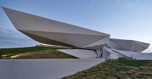
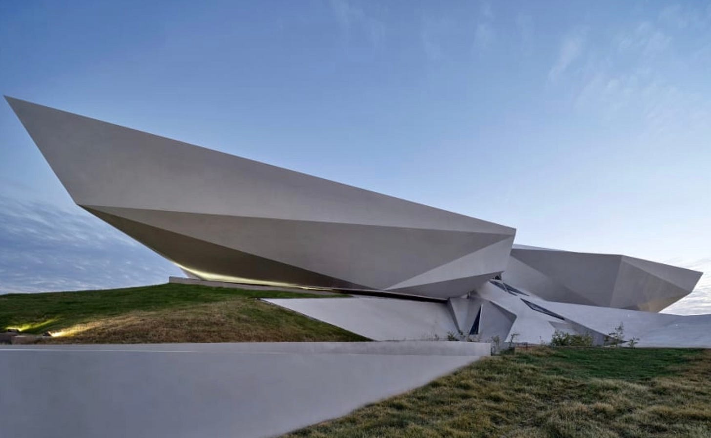
The World Architecture Festival has released its shortlist of 2022 building awardees, and would that it were much shorter; indeed a majority of the entries on the list are unpleasant, uncomfortable, inexplicable, garishly unappealing structures, the sorts of weird things that only other architects can appreciate but from which the average person instinctively recoils.
Most people don’t like most modern-style architecture. We can be confident in making that sort of pronouncement in the same way that we could say, for instance, that most people don’t like diarrhea: why would you like it? Present-day architectural styles are intended almost entirely for the enjoyment of the architect himself, not the people who have to live in and exist around the structures he designs. That’s the point of these buildings. Just look at them!
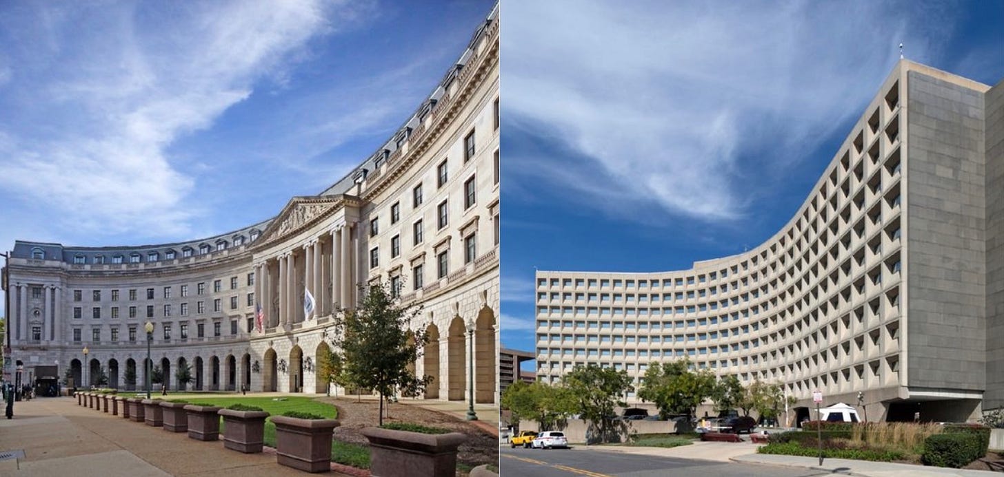
As with our strange fealty to “experts,” a great many people seem to believe that they are sort of required to like modernist architecture, or at least that they cannot hate it with the fury it so richly deserves, and/or that they must keep quiet about their hatred. How else can you reconcile the public’s continued antipathy to modern design with the fact that these buildings keep getting built? A Harris poll from a few years ago, for instance, found that Americans overwhelmingly—like earthquake-landslide overwhelmingly—prefer classical to modern design, at least in federal buildings. Which, I mean, of course they do: Just look at the beautiful, enchanting, soaring facade of the EPA headquarters next to the chunky, useless front of Housing and Urban Development. The one looks like a beautiful palace you might like to live in, marry some beautiful princess in, make a bunch of babies in; the other looks like an aborted waffle cone, or a skin graft or something.
Or compare the National Archives to the “Hubert M. Humphrey Federal Building,” the one an obvious temple to civic pride and meaningful historical sense, the other resembling an alien toner cartridge, or a municipal prison complex:
Of course people prefer to former to the latter. The stuff on the left is human scale: It is recognizably built by, and for, human beings; it resembles, at grandiose degree, the buildings we want to live in, to grow in, to build our lives in. The buildings on the right are ugly, dumpy, squat civic embarrassments designed by people who either didn’t think of the human beings that would inhabit these spaces, or simply didn’t care about them.
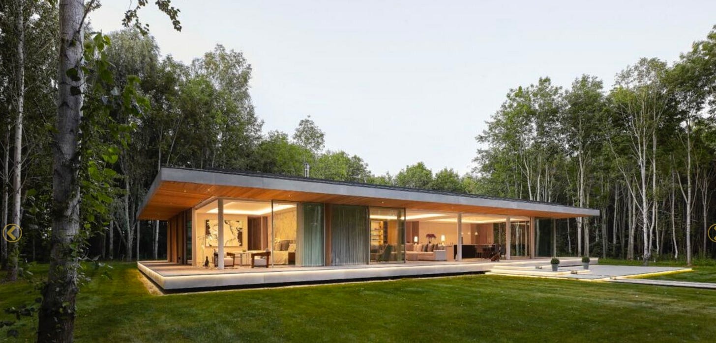
So it is no surprise that the WAF’s “short list” is short on the former and long on the latter. There are, to be sure, some modestly appealing entries there: I found interesting the Yoo Forest House, for instance, drawing as it does on “the minimal lines of classic modern architecture, born of the seminal pavilions created in Europe in the 1920s and the prairies of the US Midwest in the 1950s.” It looks a little too much like a 1960s dentist office that I wouldn’t want to live there, but it’s at least not hideously jarring, slapping you in the face with either chaotic angles or bovine dullness.
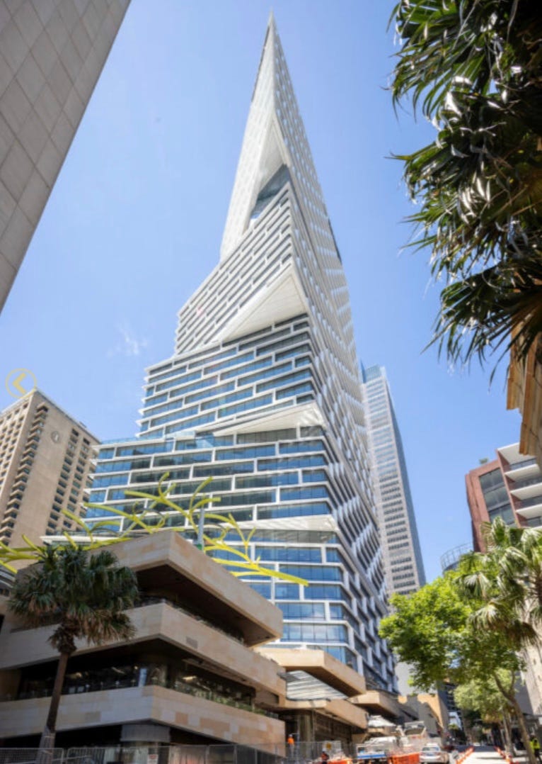
Likewise, I am modestly intrigued by the Quay Quarter Tower in Sydney; if it’s brashly geometric, it’s at least not maddeningly so, insofar as the building’s weird progression at least feels like it makes sense on a logarithmic scale. It is not immediately disorienting, in other words, which in the world of modernist architecture is instantly notable.
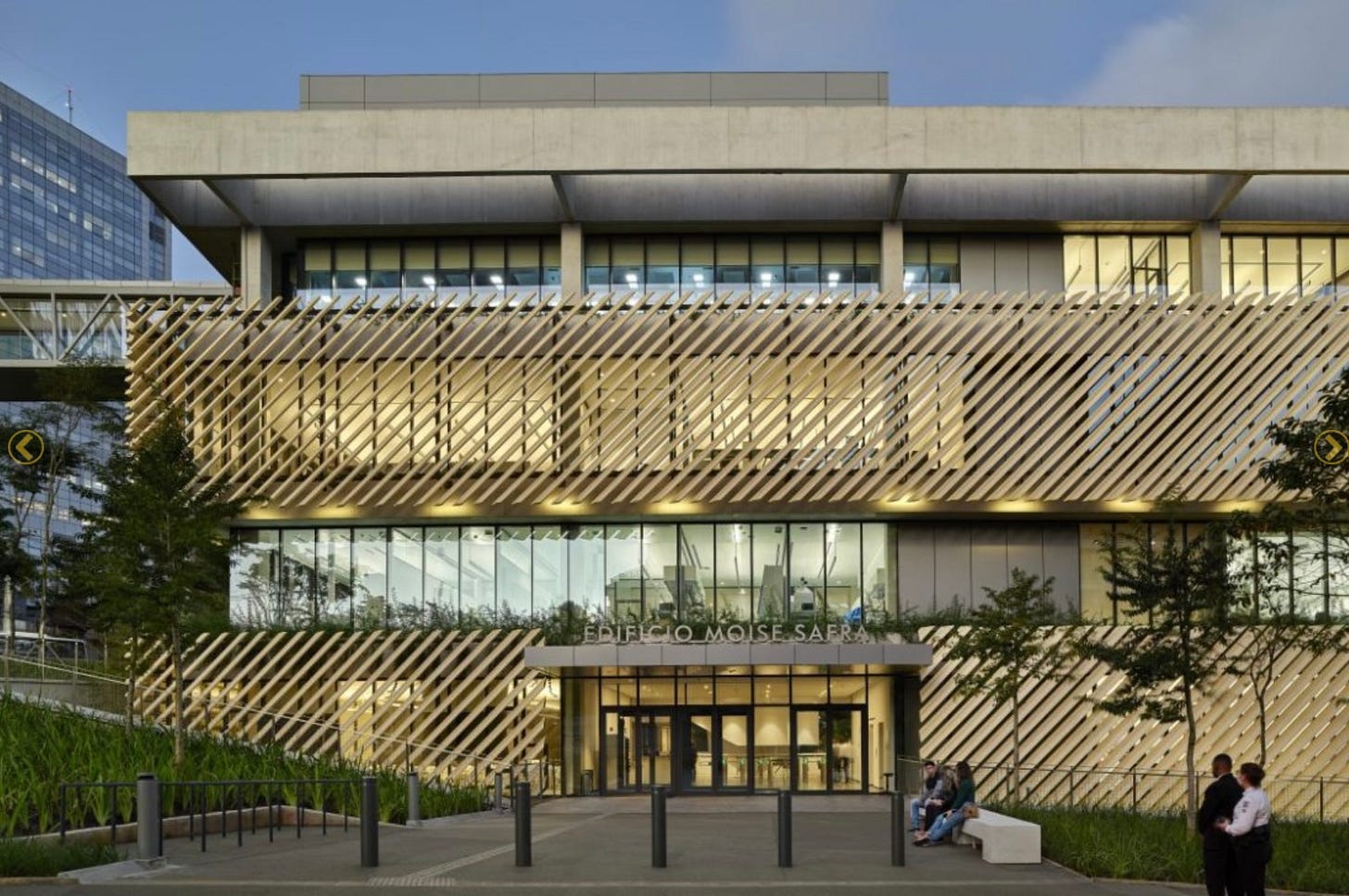
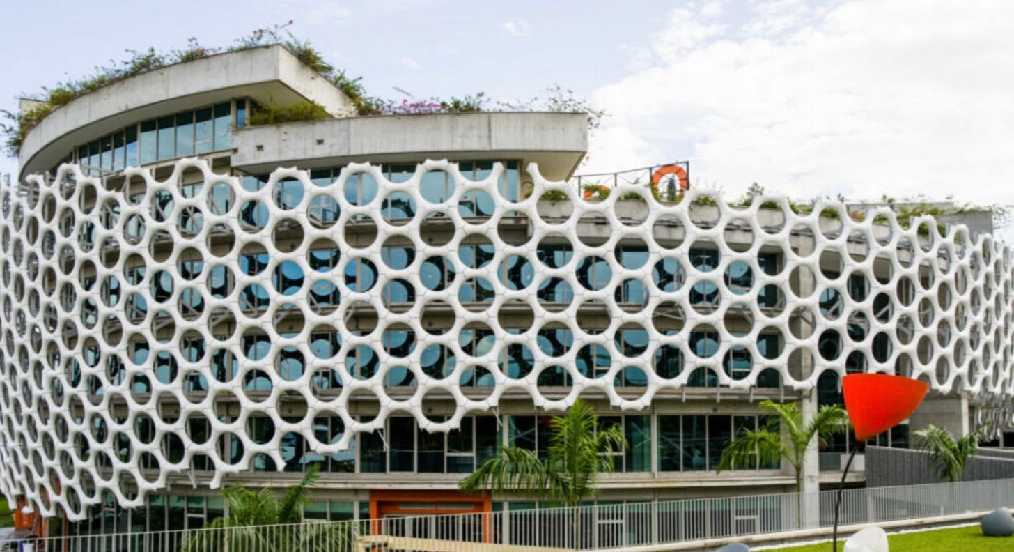
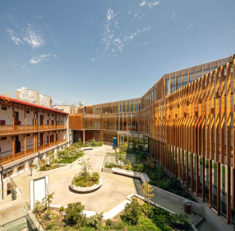
Yet by-and-large the entries on this year’s list are, like last year’s, rather awful—the kind of architecture people pray they don’t get in their own hometowns, even if they’re just barely self-conscious enough not to say so. To take one design theme common to many of the structures: I don’t know if someone held a seminar a few years ago extolling the architectural virtue of prisons, but a great many buildings on the list this year incorporate bars, lattices and matrixes that very much resemble prison-barred windows—the Albert Einstein Education and Research Center, say, or the Orange Village Headquarters, or the retrofitting of the beautiful Santiago Metropolitan Lyceum, just to name a few:
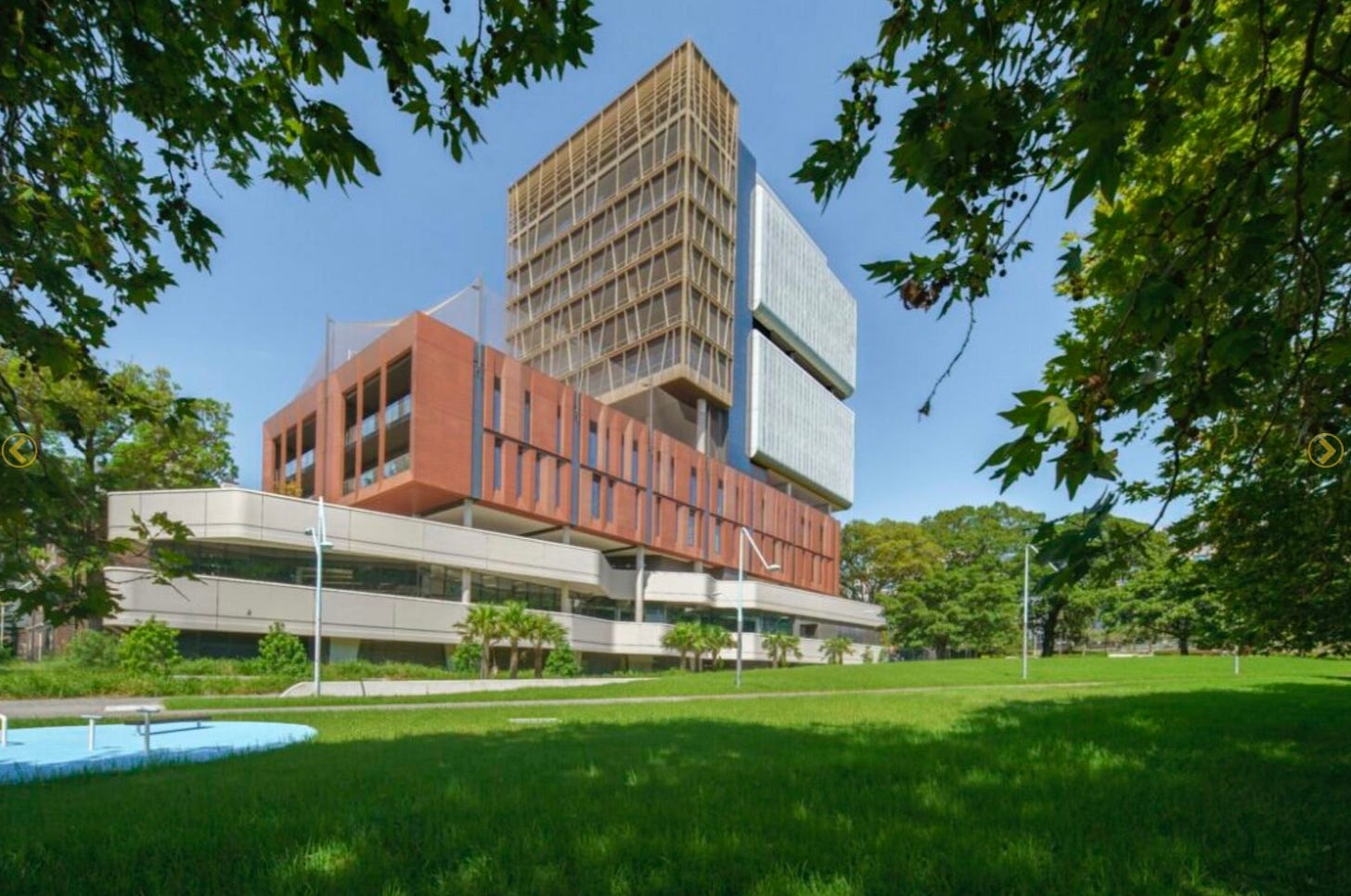
What is this? Why the impulse to create a barricade of vertical bars boxing in open spaces? What purpose does it serve other than to create disorientation and claustrophobia? Is that the point? Don’t answer that, we kind of know already. Or how about “Inner Sydney High School,” in Sydney, Australia?
Oh, isn’t it just awful? What are those, a couple of weed whacker air filters on the one side? The brown building looks like mummified pharaoh skin and the bottom section looks like a spark plug from a 1989 Ford Festiva. The building along with the school is allegedly supposed to invoke “a natural sense of intimacy and community,” but of course it is intensely hostile to both—it is a cold, awful building, contemptuous of the people within it and hateful toward those who must look at it from the outside.
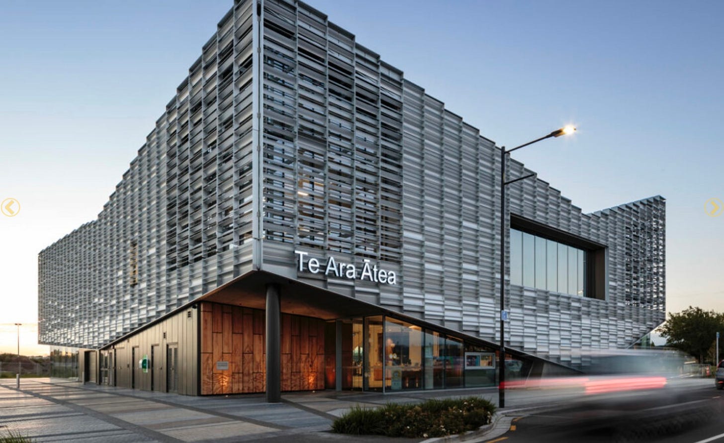
How about the “Te Ara Ātea?” This is, we are informed, meant to be a “library, community and performance facility,” if you can bring yourself to believe it:
This is terrible. There is no place for your eyes to comfortably come to rest; the building appears always in motion, but it’s jagged, serrated motion, like a langolier devouring the world. The metal cutouts at each of the corners—why? Why do they exist, if not to make you recoil in uneasiness? What’s with that one rando window?
Our buildings, our public places, our lives—they don’t have to be subject to these kinds of mind-scrambling, disorienting hack-jobs. We can demand better of this—we can demand that our civic leaders, architects and engineers put more thought than this into the buildings we must be around our entire lives. This does not mean that we should insist upon a slavish adherence to old forms or styles—it merely means that whatever comes next, be it classical or neo-classical or modernist or whatever, actually work to be visually appealing, creatively soothing, interesting, and not ugly and asymmetrical and weird.
We deserve better than this, and it is not out of our grasp to achieve it, if we’re loud enough about it. Barring that, we can look forward to an endless future in which most of our public spaces are dominated by cruel 70-degree angles and spiteful, sneering facades that are less buildings and more insults to those of us in their shadows. No thanks.



Fantastic piece. An anecdote: You are probably familiar with the very modern Koolhaas Seattle library that was built about 15 years ago and universally lauded, including by the NYT. As a fan of both architecture and libraries, I was super excited by the project and went back just to check it out a year after I'd moved away to San Francisco. What a huge disappointment. First, from the outside it looked like just a boxy grey building with only slightly elevated design elements, and the only thing that would have helped it was strategic landscaping, which was unfortunately not kept up and added to the overall dismal feeling with their sad, brown clumps of grass. Inside, I felt like I was in a modern museum and not a library, and that's when I realized that there's such a thing as cultural expectations of a space, and to deviate from it might be edgy and creative but will ultimately leave the users dissatisfied. A library connotates cozy, studious, warm, welcoming. This was none of these things. Lastly, I remember stepping off the elevator in a dark and secluded area which I thought would be a perfect place for a crime to be committed, then promptly became momentarily disoriented by the lack of clear pathway towards the main area. All in all, not good at all.
In SF, every single day I lived there I was saddened by the wealth of beautiful architecture that had fallen into disrepair or surrounded by crime and the homeless. SF is an architectural jewel located in one of the most beautiful pieces of land anywhere in Earth and we've let it go to where it is now...
I agree with you completely, the classical lines and decorative elements of a building evoke something in our soul, and that is something that is dismissed entirely in modern architecture.
It needed to be said! And then the rest of us have to live with these monstrousities as they increasingly cover downtown areas. It's almost as if architects get infected in school with some bizarre unconscious hope that in the future people with evolve into insect-type creatures, and therefore feel the need to design buildings that look like futuristic hives.
When they're designing homes, rather than public or commercial buildings this way, they also have a habit of placing huge floor to ceiling windows in places that no sane person would ever want, for privacy. Unless there are people who actually WANT the neighbors and passers-by to be able to watch them?
Do you have any psychological theory on why these architects are like this?? Why do they hate everything that isn't minimalist with harsh angles? Do they suffer from insecurity and feel they won't live up to the standards from previous times? Are they hoping that strange angles and shapes will obscure what might otherwise be too plainly mediocre or (gasp) boring?