How to read a climate change graph: A skeptical inquiry
Just asking questions!

I suppose I am an odd example of what progressive critics and most of the legacy media call a “climate denier:” I am extremely skeptical of the prevailing climate change hypothesis and I think we risk the deaths of hundreds of millions of people, possibly billions, by following it out, but I am also a pretty staunch environmentalist, or at least I care about the environment very much and want to take care of it as best as possible. For over 15 years, for instance, I have been a very strong and vocal advocate for people eating much less meat than they do and for the meat they do eat to come from very high-quality, low-impact, bio-intensive regenerative farms. I feel so strongly about this in no small part because of the miserable environmental effects of industrial farming and the much better profile of good farming. So you can call accuse me of “climate denialism” or whatever, but are you willing to pay $8 for a pound of ground beef? Because I am, and I do, every week. So there’s that.
Part of my skepticism of modern climate politics stems from how thoroughly it has coalesced around a certain set of ideas and assumptions that the vast majority of people aren’t really all that knowledgeable about. Perhaps the most persistent meme arising from the climate debate is the display or presentation of graphs showing a rapidly upward-moving scatterplot of temperature data, one that indicates a rapidly warming global climate. Take, for instance, the graph below, drawn from the website of NASA’s Earth Observatory:

That shows five disparately different datasets all indicating the same trend of a warming planet. Those are measurements from the U.S. space agency, the U.S. Department of Commerce, a Berkeley nonprofit, a British-Canadian research duo, and His Majesty’s Climatic Research Unit. When you have that many institutions and people in agreement about basic scientific data, the conclusions seem pretty slam-dunk, right? At least that’s what we’re supposed to believe.
But wait: What are these data, exactly? What does this graph actually show? Understandably most people will look at that and just say, “Hey, these data involve temperatures, the line’s going up, that means temperatures are going up, that’s it.” But if you look closer at these graphs the data they’re displaying is actually kind of one step removed from that. What these charts depict is not a straight-up rising temperature trend but rather, as the chart above makes clear, a “global temperature anomaly,” specifically one “relative to” a baseline temperature set from “1951-1980.”
Right away we can appreciate the implications of this context. We recognize that the scientists who are drawing these data and promulgating them must have chosen these parameters for a reason. These eye-catching charts do not simply display, say, the global average temperatures of the last few decades in real time; they show a comparison to the average temperatures from some other time. A qualification like that is a big deal, because it immediately indicates that the person making the qualification has a markedly specific agenda of some kind. That doesn’t necessarily mean the agenda is bad (or good), it just means there’s a sort of calculated deliberateness at work here that deserves scrutiny. A wife might be pleased to hear her husband say, “Honey, this is the best dinner I’ve ever had!” but if he says to her, “Honey, this is the best dinner I’ve ever had on a Thursday!” she’s at least going to have some questions.
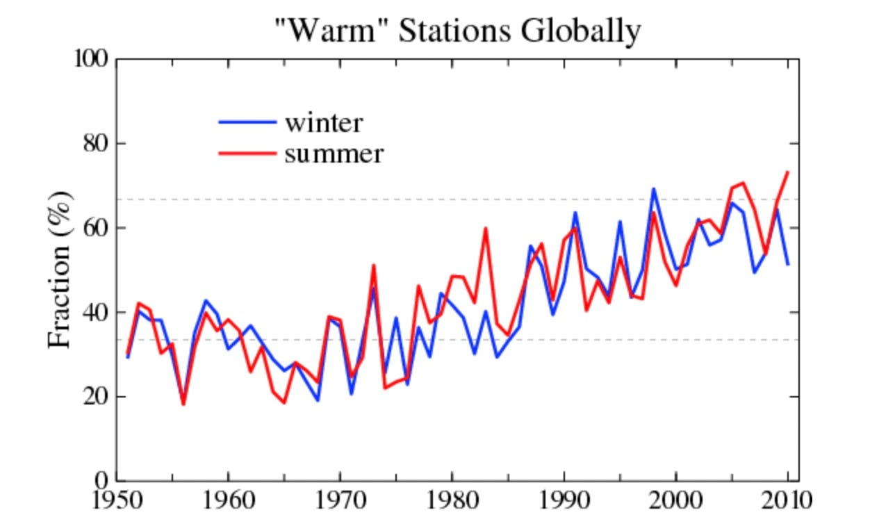
The most pressing question we should be asking about this “global temperature anomaly” dataset in this case is: Why did the scientists select 1951-1980 as the baseline for their temperature studies? What’s so special about that year? Why not 1921-1950? Or 1881-1900? Well, thankfully, the researchers have been remarkably willing to tell us why they often draw from that period of years. Here’s climate scientists James Hansen and Makiko Sato describing why they used the 1951-1980 baseline in a study about global “warm” temperature station observations:
We choose 1951-1980 as the base period because that was the base period at the time that "global warming" began to be a public issue. Also it is the time that "baby boomers" grew up, so this choice for base period allows those people to relate today's climate to that which they remember.
This is very illuminating, because if nothing else, this rationale is just completely unscientific: The “base period” for this study was chosen not really because of any meteorological significance but because (a) it was a period in which the weather itself rapidly became politicized, and (b) it’s a period of weather most familiar to the currently reigning and most politically relevant generation of American citizens. Well, that’s some important context!
Here, too, is NASA describing why its Goddard Institute for Space Studies chose the 1951-1980 period for its “ongoing temperature analysis:”
The NASA GISS team chose the period of 1951-1980 as its baseline largely because the U.S. National Weather Service uses a three-decade period to define “normal” or average temperature. The GISS temperature analysis effort also began around 1980, so the most recent 30 years was 1951-1980.
Well, again, this is pretty notable. “We chose a three-decade baseline because somebody else thought it would be a good idea” is not necessarily a bad idea, but it’s at least an admission that your ideas were not your own, which is often (though not always) what people do when they don’t want to think all that much. And “We chose these parameters because that’s when we started!” is, I’m sorry, kind of a laugh riot. It’s like the old drunk who lost his keys in the park but is looking for them under the street lamp: “This is where the light is!”
You can actually see that sort of instructive bias playing out even when the dataset is different. Here’s a team from Columbia University (also featuring Hansen and Sato) describing why they chose a 40-year 1880-1920 baseline for their review of “global temperature in 2020:”
We use 1880-1920 as baseline, i.e., as the zero-point for temperature anomalies, in part because it is the earliest period with substantial global coverage of instrumental measurements
It again feels like we’re back with the old drunk fumbling owlishly under the streetlight for his keys. “We chose 1880-1920 because that’s where the data are!” I’m not even saying that’s necessarily wrong, but it is sort of weird, or at least more than a little bit uncertain. You can point out, of course, that they couldn’t choose an earlier period because there are simply no reliable data prior to those years. I would agree and also argue that that’s kind of the point! “Our large-scale datasets are essentially nonexistent until the end of the 19th century, so let’s start there” is understandable, but it also underscores how climate science rests on a more-than-considerable amount of guesswork. We’re drawing extraordinarily major conclusions about a 4.5-billion-year-old climate based on data beginning when Chester Arthur was president.
I’m actually not saying that any of these choses are necessarily wrong, by the way. A scientist always has to start somewhere and his choices will almost always be colored to some extent by biases, preconceived ideas and half-formed suppositions waiting for an hypothesis. It happens and scientists still often get stuff done very well. It’s less important to draw any specific conclusions about these data and more important to recognize that there are conclusions to be drawn—that the things you’re being shown are actually more complex than most advocates want you to believe, and that they have been maximalized for emotional impact in order to minimalize any sort of intellectual inquiry into the matter.
But it’s okay to have questions about these sorts of things, particularly as they stand to have a tremendous impact on your life. It’s never wrong to seek more information about something; the worst thing that can happen is you arrive at the truth, whatever it may be.