Filmmakers have forgotten what normal people look like
It's all tailor-built for social media now
One of the problems of confronting major problems of massive scope and complexity is that attacking any component of it in isolation can seem effectively useless and unproductive. I like to think of what I call the engine block problem: Imagine someone dumping a five-gallon bucket of wet cement into an engine block, letting it harden, then handing you a hammer and chisel and telling you, “Get all of that cement out of there.” The sheer magnitude of the task before you is overwhelming enough that you don’t even really want to start and any place you do start feels as pointless as any other place you might’ve started.
That is in a way how I feel about modern cinema, the deeper issues of which feel so myriad and intractable that it can be hard to choose any one thing to criticize. It’s easy enough to take shots at the low-hanging fruit here: The stupid reboots, the stupid sequels, the stupid superhero movies, the woke stuff, the endless semiannual interpretations of Pride and Prejudice. All of that is both worth criticizing and pretty simple to criticize. But beyond that there are more degrading forces at work here, the collapse of some vital and almost indescribable set of artistic values and instincts, the death of something precious and potentially irreplaceable. It can be tough to figure out how to approach that in a way that allows for both birds-eye analysis and more meaningful explication.
Here is one observation: Filmmakers have en masse kind of forgotten how to create movies in which people look normal. “Normal,” of course, is a fairly subjective term, but in this case it just means “recognizable to most people” or "something that people see in their daily lives on a regular basis.” It used to be much more common for filmmakers to craft recognizable cinematography, movies in which the styles and the subjects more or less resembled the people who were ultimately meant to consume the movies. But that’s not really the case anymore.
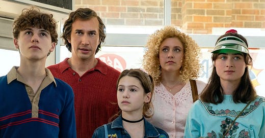
Here’s a good example. Consider the upcoming Noah Baumbach film, White Noise, an adaptation of a 1985 novel featuring a family’s darkly comedic attempt at survival against an “airborne toxic event.” It looks pretty par for the course for today’s movie landscape—set in the 1980s, some kind of cynical satire of modern American suburban/consumerist life or something, some witty one-liners, some shallow but deep-sounding observances about stuff, whatever. It’s hard to get excited about these sorts of features when they look aesthetically indistinguishable from everything else. Here’s a shot of the Gladney family:
I don’t know about you but I find this just highly unpleasant to look at. Everything is too perfect; the colors are too primary and too bright and un-faded, the clothing is too pressed, the hair is obviously too styled and frozen in place with product. Everything feels preordained, as if part of a computer simulation that would come out the exact same even if you ran it 10,000 times. I understand this is how people think everyone looked in the 1980s and it’s true the decade did have some screwball fashion, but this looks less like the 1980s and more like 1985: A New Theme Park From Universal Studios in Orlando, Florida. It’s immediately weird and unconvincing.
Consider in contrast the depiction of another cinematic family from what is at this point nearly two decades ago, the Hoovers, from Little Miss Sunshine. Like White Noise, Little Miss Sunshine is meant to be a sort of offbeat social commentary of sorts, though the depth of its character study elevates the subject material into something much more rich and rewarding than merely that. Here are the Hoovers eating at a cafe in La Puente:
Note how much more normal everything feels in this shot. Everyone here is wearing clothing that feels both recognizable and actually lived-in; the clothing itself has things such as wrinkles and non-rectilinear angles; nothing is dirty, but nothing is too clean, either; the hairstyles just look like, you know, hair; in short this just looks like a bunch of people you might have passed at a La Puente cafe yourself. It’s not jarring and discomfiting and weird and inexplicable, at least, which helps you to, you know, enjoy the movie.
Here’s another good one. Consider this still from the American bio-drama Till about the murder of Emmett Till:
Notice anything weird about this scene? Like, I dunno, these young boys in 1950s Mississippi picking cotton in what looks like a suite of brand-new Sears and Roebuck after-church wardrobes? No dirt, no rips or tears, nothing faded, everything looking like it was ironed two hours ago. I don’t know how familiar you are with the particulars of midcentury black southern U.S. history, but most black mothers were not letting their kids go out and do what was effectively brutal sharecropping work dressed like this. And the kids themselves look immaculate; even if they haven’t started working for the day their perfectly scrubbed appearances are conspicuous and odd. This is almost quite literally a whitewashing of history here.
Here in contrast is a still from the classic southern movie Fried Green Tomatoes:
This, of course, is what is meant by “normal.” This looks like a world you might inhabit; really it looks like the world you already inhabit. It looks like the clothing has been worn more than once, it looks like the people in the scene have been doing stuff, like they did stuff earlier in the day and they’re about to go do stuff after the scene is over. You are not immediately unsettled by this scene; it does not look like a theme park ride or a museum exhibit; the filmmakers did not feel the need to craft a weird, ethereal world of glistening, unsullied supra-beings.
This is a relatively recent aesthetic shift. Up until just a few short years ago the cinematic impulse wasn’t as homogenous as it is now. In fact in some cases we’ve been able to witness the tonal mutation occur almost in real-time. Consider Stranger Things, a show which did more than any other media property to usher in the sort of 80s chic revival that has subsumed much of pop culture for the past six years or so. Here’s a shot from the first season:
This is pretty decent stuff. It’s a bit more stylized and lustrous than it probably should be—there’s a little too much makeup in this scene, and the backdrop feels too brightly lit, there weren’t that many lightbulbs in the 1980s—but overall the Duffer Brothers knew how to craft a pretty compelling portrait of average middle-class life in that decade: You have Barb’s big glasses and her weird modish ruffled shirt, a turtleneck, some of the straightened hair left over from the 1970s and some of the big hair that was ascendant in the 1980s at the time. You have a good mix of some of the odder and more idiosyncratic fashion elements of the decade mixed with the more anodyne stuff that filled out the background of those years. It’s good work.
Yet just a few years later by the third season we had…this:
I don’t need to tell you this is an obviously inferior artistic decision. This is how Millennials picture the 1980s; it’s not really how the 1980s was, not in practice or even in theory. That’s kind of unforgivable, because the Duffers themselves were there and they should know better; plainly at one time they did know better. But something changed in the intervening years; either the Duffers decided to do things differently or the Netflix heads demanded it, but in either case we went from a rather subtle and appreciative homage of a fun period in American aesthetic history to a corny, goofy, unpleasant caricature of it—a product of the bizarre zeitgeist sweeping the broader American film canon.
Lest we think it’s just a problem with period dramas, we can also see the issue cropping up in more run-of-the-mill movies not normally known for cinematography or artistic distinction. Here’s a shot from the latest aging Boomer rom-com Ticket to Paradise starring George Clooney and Julia Roberts:
This might not look all that striking or notable, but that’s kind of the point, for two reasons: First of all, this kind of aesthetic—the pastels, the basic clothing, the perfect hairdos, the quarter-inch of concealer on every single exposed body part—is all pretty standard for most big-budget space-filler movies these days, you see it everywhere and you’re not apt to realize how common it is; and second of all, it’s not really supposed to be striking or notable. Movies starring George Clooney and Julia Roberts these days are supposed to be like Targets or Bed, Bath & Beyonds: More or less faceless, quotidian markers of modern suburban life, arguably more signifiers than signified, bland and inoffensive.
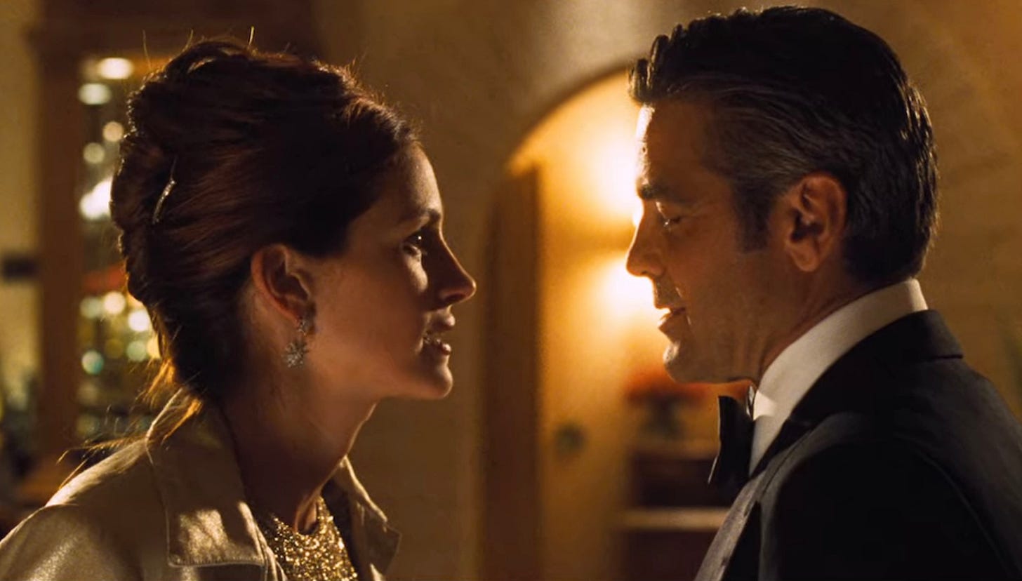
It wasn’t always that way. Here’s a scene from another Clooney-Roberts mashup from two decades ago, Ocean’s Eleven:
This feels radically different, doesn’t it? It feels like the filmmaker took a gamble here, if only a very small and safe one. You wouldn’t call this kind of film “edgy,” but there’s an edge to it, or at least something that feels slightly more like real life, like real people doing real things. A few more hairs out of place, Tess’s collar popped slightly in the back where it shouldn’t be, a little insignificant but noticeable roll of pudge where Danny’s lower jaw meets his neck…it all has the feel of a film crew that didn’t obsess as much over the limitless details of appearance and aesthetic and who were thus able to craft much more realistic and convincing film environments.
What explains this shift? That’s a big question that necessitates a broader exploration than we can offer here right now. But briefly I would argue that most of it—maybe nearly all of it—probably has to do with social media in some form: The utter ubiquity of nonstop 24/7 media, the awareness that every image from every project could be broadcast all over the Internet at all hours of the day, the algorithmic mandates that reward kitschy, quasi-perfect presentation over realism and verisimilitude—all of that is likely a huge driver of the shift from normal-looking movies with normal-looking people to the Disney-fied, overproduced, boring-looking stuff we have today.
Different eras have different creative crescendos and slumps, of course, and I suppose now we’re just living through a trough of creativity, a cratering of creative impulse in favor of the algorithms. You never can tell how long these things are going to last, of course; maybe this one will persist at least as long as social media is around. Yet another reason, if you needed it, to delete your Twitter account and do something better.


